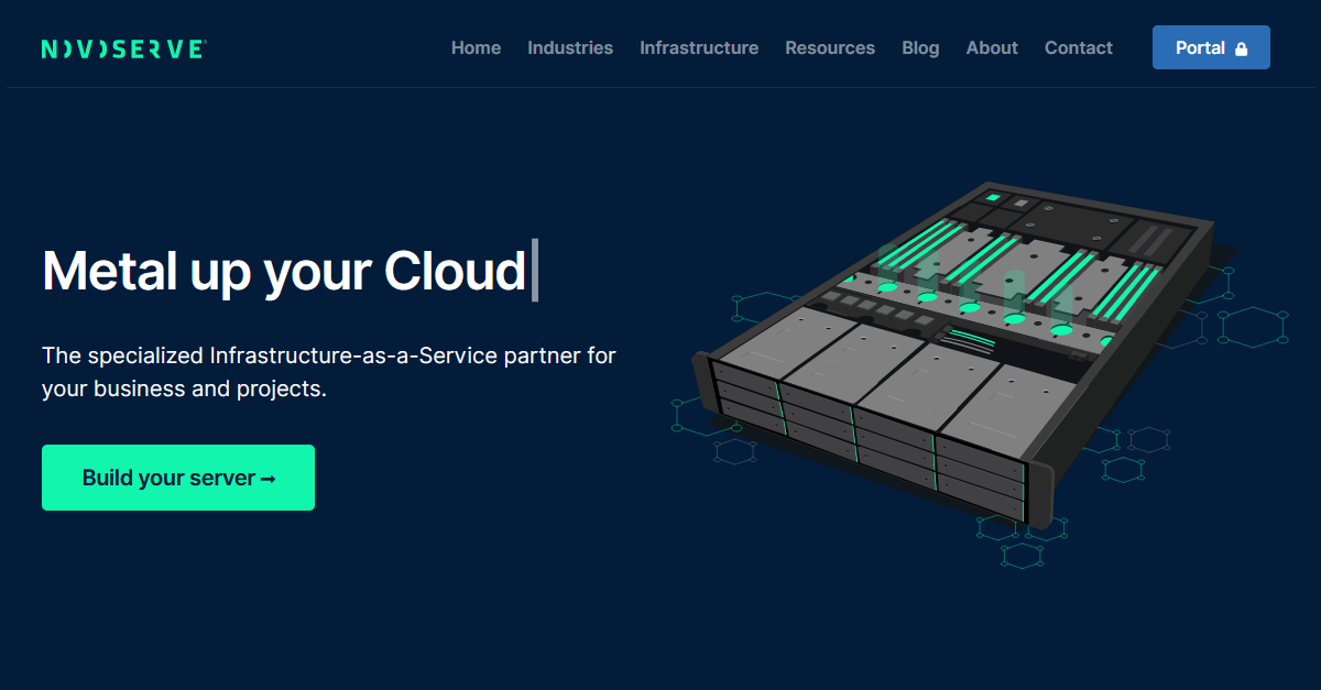
Just in the nick of time, before entering 2022, we launched a new look and feel of our brand and website. Last year we were undergoing some changes within. Moving to a new HQ to support our growth and far-reaching global ambitions was one of them. We worked on a new brand that conveys our team, culture, customer feedback, and plans.
"We felt it was time to revive and modernize the look and feel of our company," says Roy Premchand, Chief Commercial Officer. "First, we gathered the opinions on our previous brand and website of those working within the company. We tried to figure out what could be improved and what needed to be dropped entirely. We were then able to make some collective decisions about how to improve the brand."
"We are proud to announce our updated look and feel with the introduction of our new logo. The new website provides you with a clear message of who we are and how we help your business. While providing a refresh for our brand and matching our updated website, the new logo also gives us more scope and flexibility when dealing with online platforms and apps," added Roy Premchand.
However, much of the content is still the same. A modern and clean design will simplify our products, services, and information navigation.
So, welcome to our new website. It's here for you to check out. Let us know how you feel about it.
[[roy,blog]]
